-
Notifications
You must be signed in to change notification settings - Fork 10
05. Mapping
To map the fitted elements, click on ![]()
Map Fittings in the
toolbar. Only those fittings which are enabled in your Peak Fitting
list will be mapped. It is recommended that you enable all fittings for
mapping as each fitting results in an individual map which can be
disabled later.
For extremely large maps, you may see some performance gain from disabling some fittings, especially if you are using data filtering or Optimizing/Least-Squares Curve Fitting or Fitting Solver algorithms.
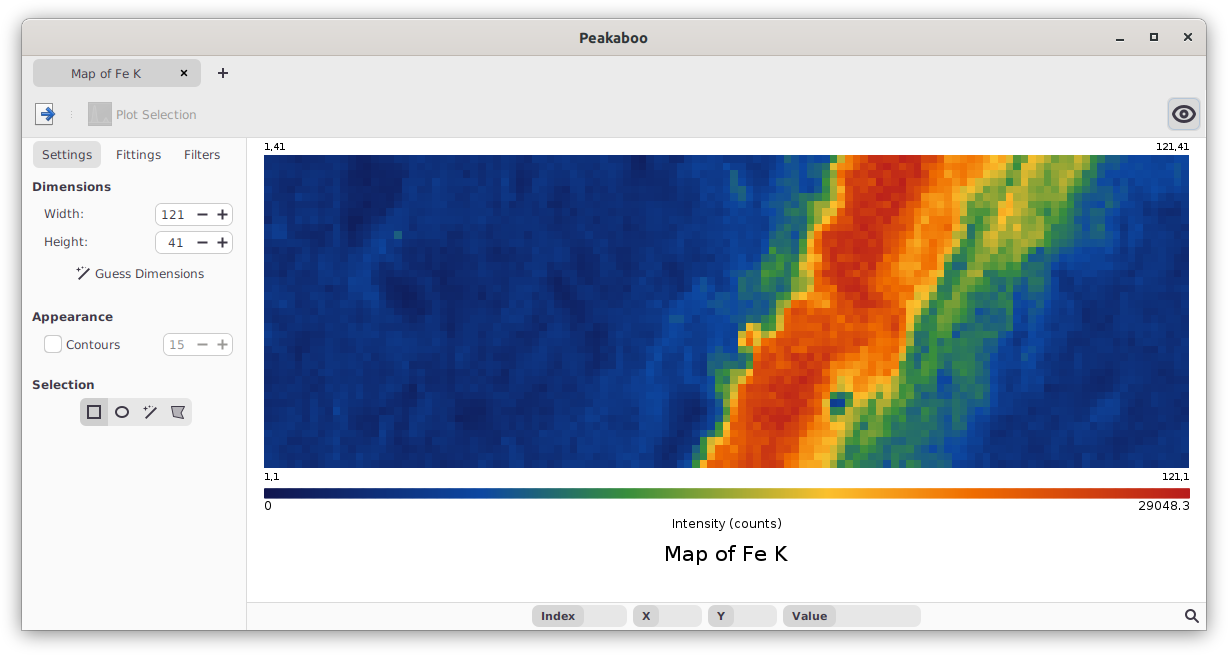
Peakaboo’s mapping window
After the mapping is complete, a window will appear with a coloured map, a scale, and a list of the mapped element lines. For datasets which contain dimension information, map widths and heights are automatically set to appropriate values. Otherwise, Peakaboo can attempt to find dimensions that produce contiguous images. If this does not work (it usually does), you will have to adjust the dimensions yourself.
All fittings will be represented in the initial map. To get the
individual element maps, uncheck all other fittings in the Peak Fittings tab in the sidebar, leaving the element fitting you wish to
view. Maps can have filters applied to them the same way that spectra
can, which can help reduce outlier values and noise. For more
information, see the section on Map Filtering.
Composite is the default map mode. It sums the intensities from
different fittings into a single map. The data is displayed with a heat
map colour scale, but can also be shown in monochrome by selecting
![]()
View → Monochrome
Composite maps are scaled against a global maximum of all fittings. If
you wish to scale a fitting to its own highest intensity, select
Visible under the Sort By section in the sidebar. A minor element
will show very a low intensity distribution using All, but appear much
more intense with Visible when displayed alone.
Select the Overlay option from the dropdown list under the Peak Fittings
sidebar tab to use this mapping mode. It allows you to assign different color
groups to various fittings, which are then overlaid on the map. Each color
represents the intensity of its respective fitting group, providing a visual
distribution of multiple elements simultaneously.
Caution: Be mindful when selecting colors for overlays, as some combinations may create ambiguity. It’s important to select distinct colors to clearly represent each fitting group. Since Red, Green, and Blue are primary colors used in computer displays, choosing them can help minimize this issue.
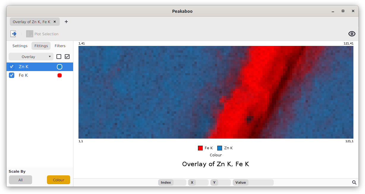
Overlay of Iron and Zinc concentration
The Scale By settings in Overlay mode dictate how the colors of fitting groups relate to each other:
-
All: This setting uses the highest intensity from all fitting groups as a benchmark to scale colors for every group, providing a uniform intensity comparison across all colours in the map.
-
Colour: Each color group is scaled according to the highest intensity found within that specific group. Caution While this method highlights each group distinctly, it will distort quantitative accuracy, rendering the map more suitable for qualitative analysis.
To enhance the clarity of overlays where different elemental maps blur together,
consider using the Low Signal Removal map filter. This filter truncates weaker
intensities, making it easier to distinguish between overlapping maps. For
detailed instructions on applying this and other map filters, refer to the
section on Map Filters.
In Peakaboo, you can map the ratios of elements by selecting Ratio from the Peak Fittings dropdown list. Choose the fittings you want to compare and assign a
color to each from the dropdown lists provided next to the fittings.
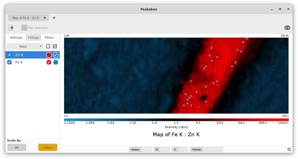
Ratio of Iron and Zinc
The Scale By settings in Ratio mode dictate how the colors of fitting groups relate to each other:
-
All: Scales the fitting groups based on the highest intensity from either group, applying this maximum value to both groups. This method provides a unified view of intensity across the mapped ratios.
-
Colour: Each group is normalized individually against its own greatest intensity before ratios are calculated. Caution: This approach enhances the visual distinction between groups but will lead to quantitatively inaccurate representations. It's best used for qualitative insights where visual separation is more important than accuracy.
To explore the relationships between different elements in your dataset, select
Correlation from the Peak Fittings dropdown list. Choose which fittings to
analyze and set their respective axes using the controls provided next to each
fitting.
Correlation maps are two dimensional intensity histograms, illustrating how often map points fall within specified intensity ranges. This graphical representation helps identify patterns or relationships between the selected elements.
Adjust the number of intensity ranges (or bins) using the Granularity control
located at the bottom of the sidebar. This allows you to change the resolution
of the correlation map, tailoring the detail level to your analytical needs.
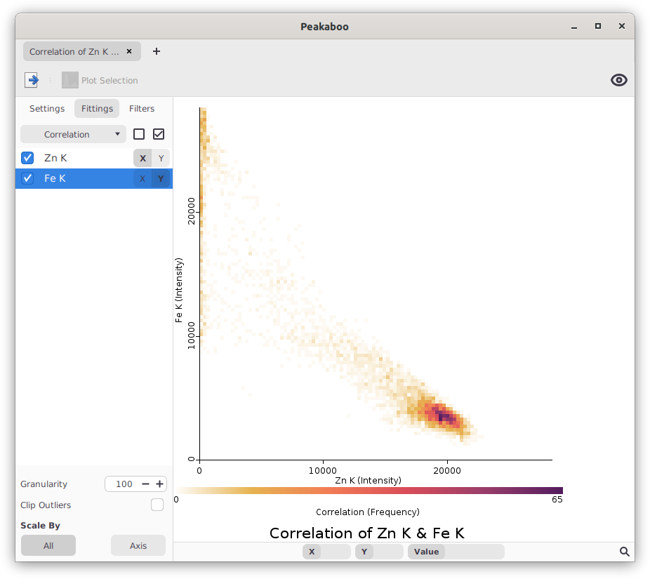
Correlation of Iron and Zinc
Just as with spectra, filters can improve the visual quality of your maps by cleaning up data. To add filters:
- Navigate to the
Filterstab in the sidebar. - Click

Add Filtersto view and select from the available filters, organized by type in expandable folders. - Choose your desired filter, then click

OKto apply it to your map.
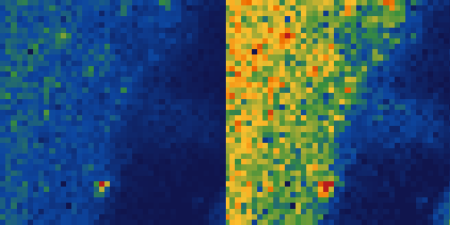
Once a filter is added, adjust its parameters by clicking the ![]()
Settings
button next to the filter. This opens a dialog where you can modify settings and
immediately see the impact on your map. To learn more about a map filter, you
can view it’s description by hovering over the ![]()
Help icon in the
settings dialog.
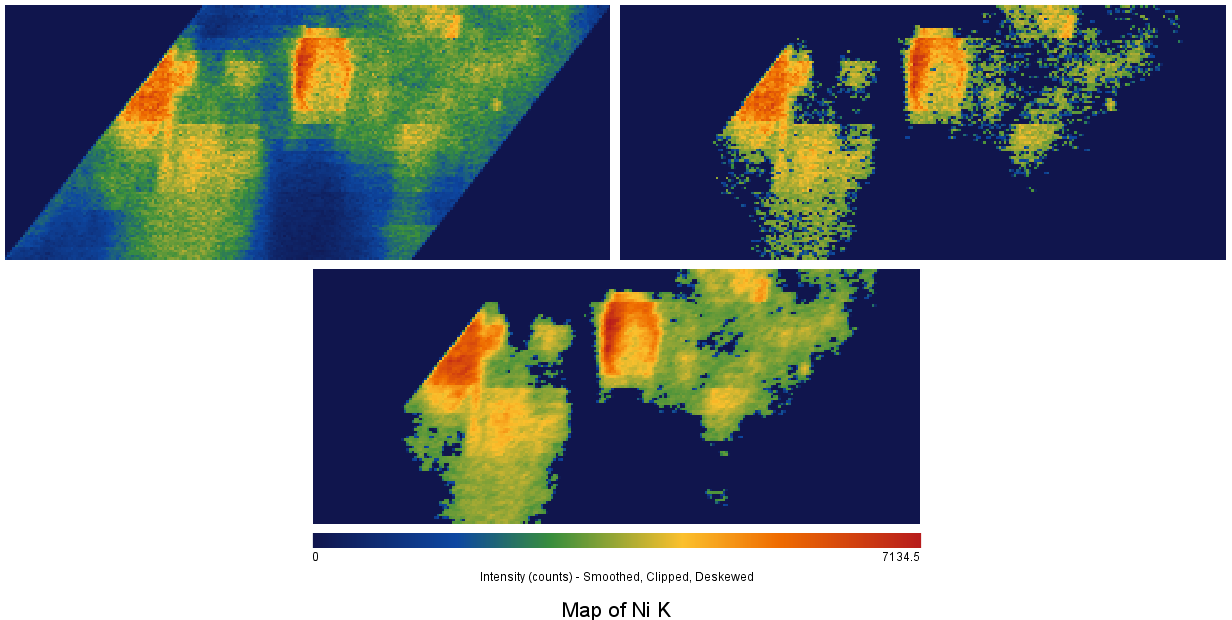
Comparison of mapping of a nickel intensity distribution before and after being treated with the low signal removal filter (40% setting) and with the weighted average filter (radius:1, repetitions:1)
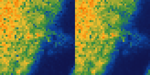
Comparison of mapping data before (left) and after (right) being treated with the Denoise filter where areas of high noise are replaced with a smoothed value without altering the rest of the map
Caution: Filters modify map data individually for each fitting before they
are combined into the final map, which can sometimes lead to unexpected results.
For instance, if a Signal Cap filter with a cap of 100 counts is applied
separately to Fe K and Zn K maps before merging them, the combined peak value
might reach 200 counts, not the 100 you might expect.
To save your maps for further use or presentation:
- Click the

Exportbutton on the toolbar. - Choose

Export as Imagefor visual formats. You can save maps in:- Pixel Image (PNG): Best for general use where ultra-high resolution is not required.
- Vector Image (SVG): Ideal for high-quality publications where scalability is needed without any loss of detail.
Additionally, map data can be exported directly in several formats:
- CSV (Comma Separated Values): Useful for data analysis in spreadsheet programs or specialized data analysis tools.
- All-In-One Zip Archive: This includes a CSV file and map for each fitted element and a session file for archiving or sharing.
These options ensure your data is preserved in formats that suit various needs, from detailed analysis to professional presentation.
If you encounter missing or skewed spectra within your dataset, you can easily remove these anomalies from your maps:
- Identify the Problematic Data Point: Hover your mouse over the suspicious data point in the mapping window. The index of this point will be displayed in the status bar at the bottom of the window.
-
Inspect the Data Point: Switch to the plotting window and ensure it is set to Individual Scan mode. Input the problematic
Index #in theScanfield at the bottom of the window to view the specific data point. -
Exclude the Data Point: Click the

Excludebutton to mark the scan as erroneous and remove it from the dataset.
Once excluded, the data point will not appear in future maps; instead, it will be interpolated from neighboring data points.
Peakaboo offers four intuitive ways to select subsections of a map, each accessible from the Settings tab:
- Rectangular, Elliptical, and Free-hand Selections: These tools allow you to draw shapes directly on the map to create a selection mask.
- Point Selection by Similarity: Click on a point to select all contiguous points of similar intensity. Double-clicking selects all points across the map with similar intensity, regardless of their location.
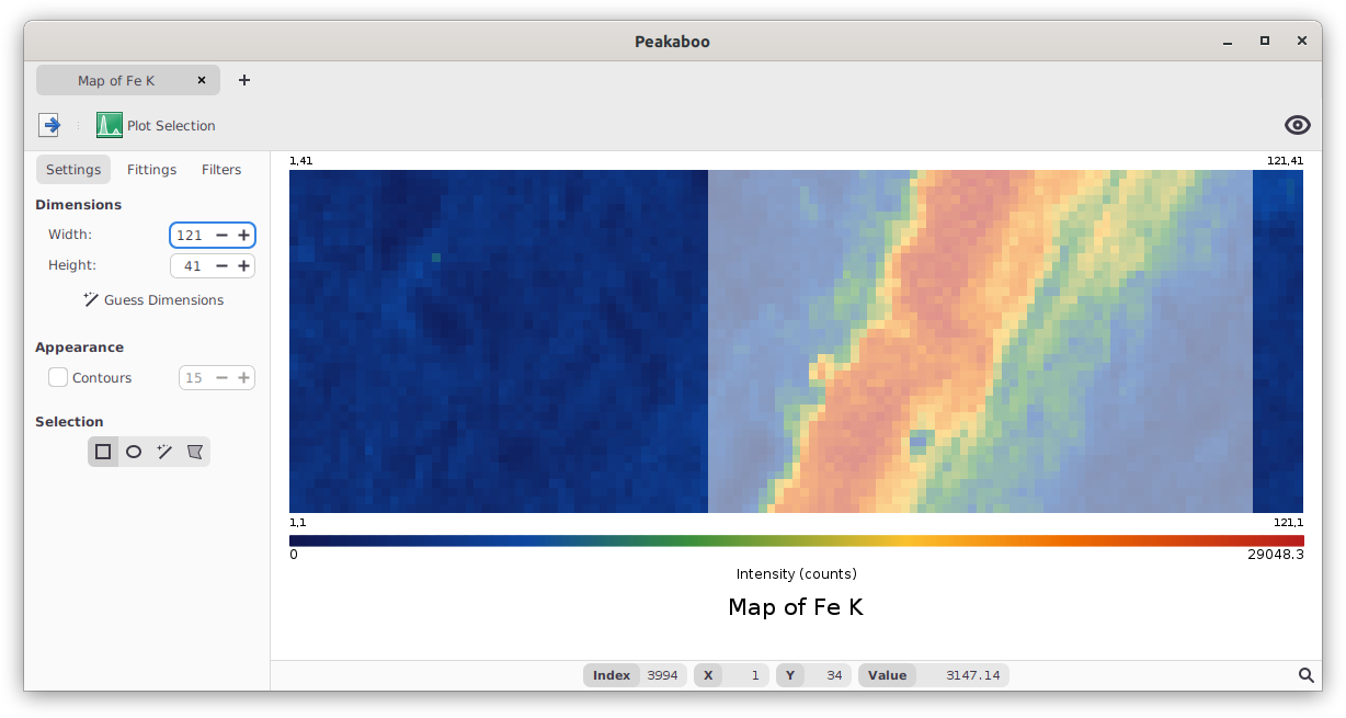
Selecting a cropped subset of a data set
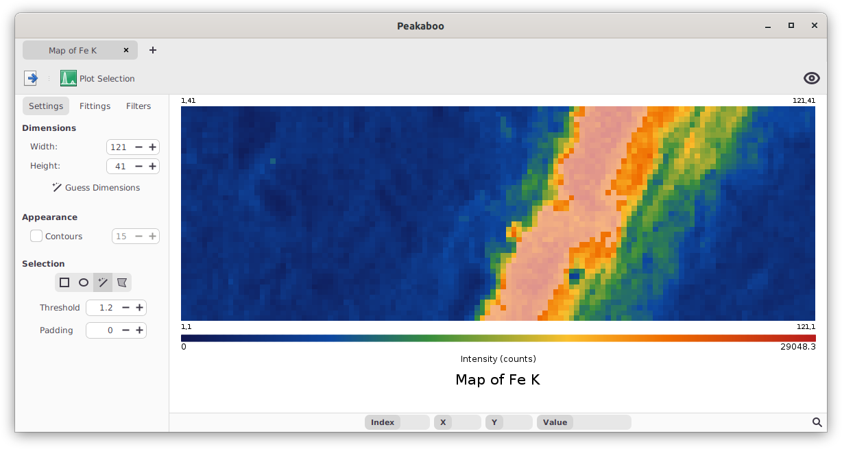
Selecting a series of contiguous high-intensity points from the data set
-
Threshold: This setting adjusts the sensitivity of point selection. Setting the threshold
tmeans that clicking on a point with intensityiselects all contiguous points whose intensities fall betweeni ÷ tandi × t. For instance, a threshold of 2 will select points between 50% and 200% of the intensity of the clicked point. -
Padding: Determines the inclusion of adjacent pixels around the selected points. A padding of 1 means all directly neighboring pixels are also selected. Increasing the padding value
pexpands the selection byprings of pixels around the initial selection.
Hold the Control key while clicking to modify selections:
-
Control+Clickon an unselected point adds it to the current selection. -
Control+Clickwithin a current selection removes that point from the selection.
These methods apply to rectangular, elliptical, and free-hand tools where dragging is involved. By combining these techniques, particularly with point selection settings, you can tailor complex selections, such as isolating a specific ring around an intensely active region without including it.
Peakaboo enables you to extract and analyze spectra from designated regions within your map. After using the selection tools described earlier to define a subsection of your map:
- Click

Plot Regionto initiate the spectral view for the selected area. - A new tab will open in the plotting window, displaying the spectra from the chosen subsection.
- You can then apply various Peakaboo tools and filters to further analyze these spectra.
This feature allows for targeted spectral analysis, providing insights specific to selected areas of your map.
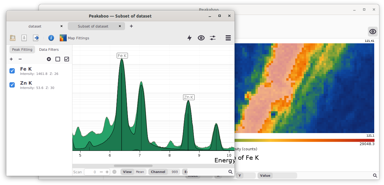
Plotting window showing data for a subset of the original data set