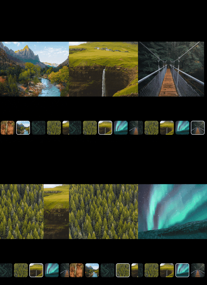
npm i @akumzy/react-native-animated-gallery --save
or
yarn add @akumzy/react-native-animated-gallery
No additional step is required.
No additional step is required.
First of all, import the component.
import AnimatedGallery from "@akumzy/react-native-animated-gallery"Then use it like this.
import * as React from "react"
import { Text, View } from "react-native"
import AnimatedGallery from "@akumzy/react-native-animated-gallery"

export default () => {
  const images = [
    {
      id: 1,
      url: "https://images.pexels.com/photos/2347011/pexels-photo-2347011.jpeg?auto=compress&cs=tinysrgb&fit=crop&h=1200&w=800",
    },
    {
      id: 2,
      url: "https://images.pexels.com/photos/2387877/pexels-photo-2387877.jpeg?auto=compress&cs=tinysrgb&fit=crop&h=1200&w=800",
    },
    {
      id: 3,
      url: "https://images.pexels.com/photos/1624360/pexels-photo-1624360.jpeg?auto=compress&cs=tinysrgb&fit=crop&h=1200&w=800",
    },
  ]

  const Loader = () => {
    return (
      <View style={{ justifyContent: "center", alignItems: "center", flex: 1 }}>
        <Text>Custom Loader..</Text>
      </View>
    )
  }

  return (
    <View style={{ flex: 1, backgroundColor: "#fff" }}>
      <AnimatedGallery
        imageUrls={images}
        renderLoader={<Loader />}
        disablefullScreen={false}
        thumbBorderWidth={3}
        thumbBorderColor={"white"}
        spacing={8}
        imageSize={90}
        backgroundColor={"#0000"}
        onEndReached={() => {
          console.log("yay! end reached")
        }}
        invertThumbDirection={false}
        invertGalleryDirection={false}
      />
    </View>
  )
}imageUrlsrenderLoaderimageSizespacingthumbBorderWidththumbBorderColordisablefullScreenbackgroundColoronEndReachedinvertThumbDirectioninvertGalleryDirection
Provides Data to the component
| Type | Required |
|---|---|
| Array | yes |
Custom loader for component
| Type | Required |
|---|---|
| ReactElement | no |
Set the size of the thumb nail to square proprtion
| Type | Required |
|---|---|
| imageSize | number |
Set the sapcing between thumb nail.
| Type | Required |
|---|---|
| spacing | number |
Set the border width for thumb nail.
| Type | Required |
|---|---|
| number | No |
Set the border color for thumb nail
| Type | Required |
|---|---|
| string | No |
Disable the fullscreen view of image
| Type | Required |
|---|---|
| boolean | No |
Set the backgroundColor for gallery when not in fullscreen mode
| Type | Required |
|---|---|
| string | No |
Called when all rows have been rendered and the list has been scrolled to within onEndReachedThreshold of the bottom. The native scroll event is provided.
| Type | Required |
|---|---|
| function | No |
Reverses the direction of scroll. Uses scale transforms of -1.
| Type | Required |
|---|---|
| boolean | No |
Reverses the direction of scroll of gallery. Uses scale transforms of -1.
| Type | Required |
|---|---|
| boolean | No |
|
|
Vivek JM [email protected] |


