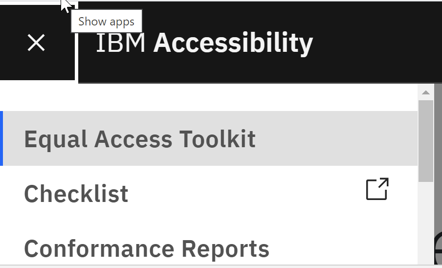
Expand/Collapse sections from Left Navigation are not operable using Jaws -Left Nav-Blocker for Jaws users #7086
Labels
status: needs triage 🕵️♀️
status: waiting for author's response 💬
type: a11y ♿
version: 10
Issues pertaining to Carbon v10
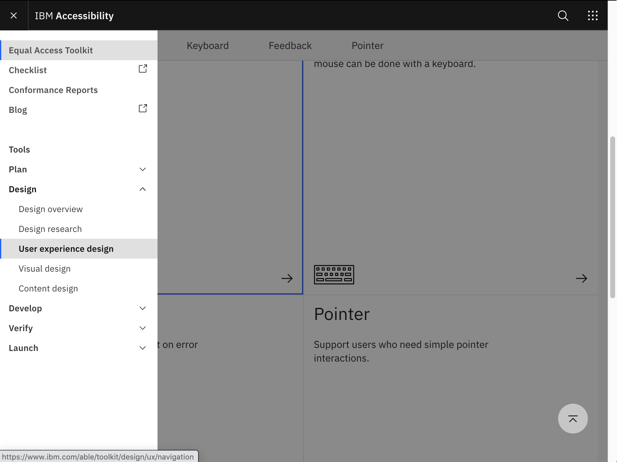
Expand/Collapse sections from Left Navigation are not operable using Jaws Browser mode(Default Mode).
Detailed description
Steps to reproduce the issue
Menu is operable with out Jaws.e
Additional information
So, here are the minimal steps that need to take place:
role="menu"off the div (or just remove the div)That will resolve the main keyboard issue they were talking about, where executing on the collapsed sections caused an odd focus loss.
aria-expanded="false"Obviously that would need to be changed to "true" when the button is pressed. The reason you're adding this is to show that the button both controls the display of and indicates the state of the navigation region.
aria-labelandtitleon the button that opens the left nav. I'd suggest "Side navigation" since that is the label given to the navigation region.Combined with the aria-expanded in the prior step, this will result in the user hearing "Side navigation button expanded" (or "...collapsed")
aria-haspopupfrom the buttons that form the expandable left nav items.These already have an
aria-expandedattribute. The other is unneeded -- and incorrect, potentially causing some glitches.role="menuitem"off the anchor children of the list items. They aren't menu items, and the link role is totally fine.Together, those things resolve most of the problems. However, there are some other issues that need to be addressed:
the tab order does not place the left nav immediately after the button that exposes it, but instead puts it after the items in the top nav (which on the page I'm looking at is only "IBM Accessibility"). Hopefully it is a simple thing to inject the left nav before the top nav. That is the logical place. Otherwise, the user opens the left nav with the button and then doesn't proceed into it. Fortunately at the same time the left nav is collapsed, the top nav is as well, so it's only one item, but it's still confusing.

There is a bit of a gotcha here, because in the full desktop version, (where there is no left nav button), the top nav is exposed before the left nav. However, when the breakpoint occurs, I really think the DOM order has to be changed -- or else the button to open the left nav needs to follow IBM Accessibility in the tab order (which is not really any odder than what is happening right now). I think the button itself could actually be in the nav region.
The left nav must collapse when focus leaves the nav region, otherwise it obscures the content in the main region, as shown in this screen shot where you can't see any of the text of the item with focus. Note also that since the left nav is still open, there is a lightbox effect, graying out main content.

I personally think visual design should get pulled in to consider whether a hamburger menu icon (when closed) and X (when open) are good affordances for indicating the expand/collapse nature of the side navigation. I would have thought something that infers something behind exposed or hidden would be better (like up and down triangles are used to indicate state and action for an expandable section). I've seen icons like this used.

Final note. As mentioned in a prior comment, this all only applies to the left nav. The right-side 'navigation' is much more menu like in its appearance and constraints (no expandable sections) and I think it makes total sense to implement it as such (along with all the correct keyboard interaction).
The text was updated successfully, but these errors were encountered: